Mercury Viral Upsell
Overview
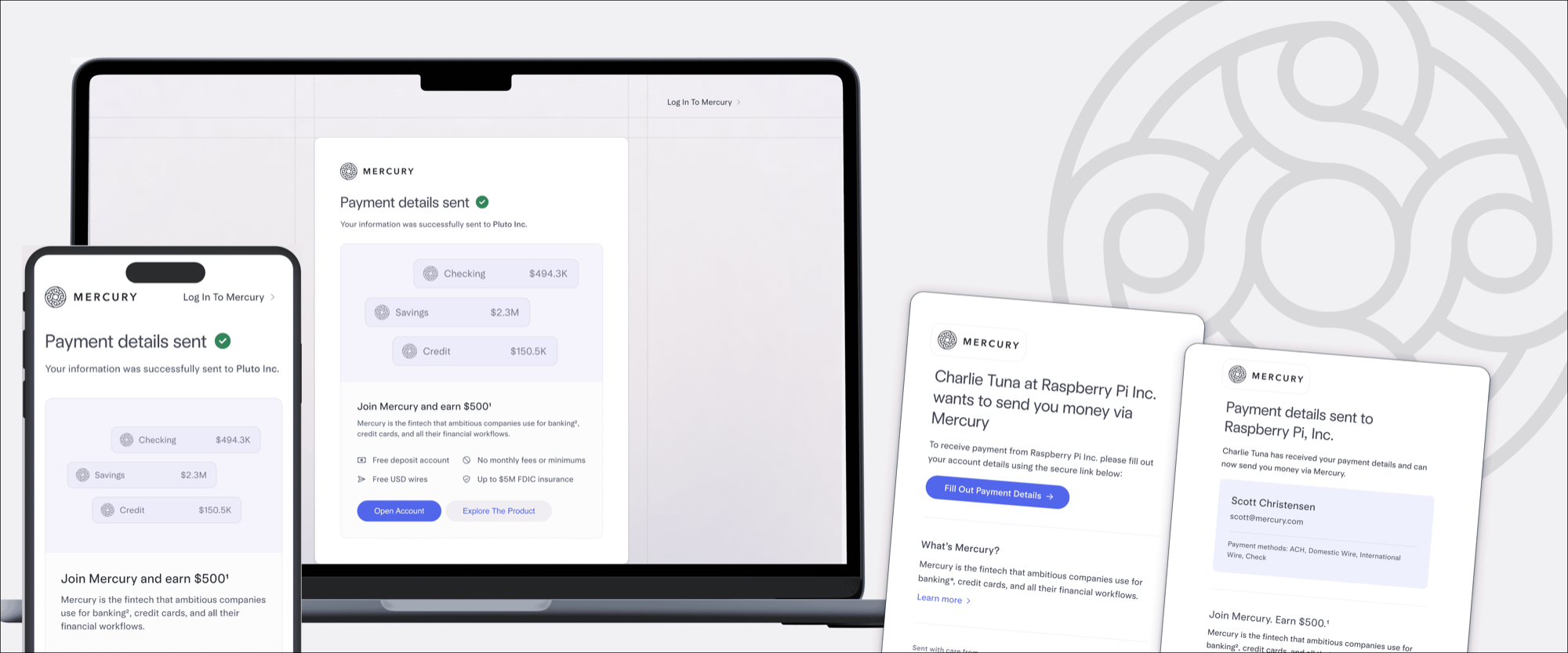
Mercury's viral upsell, the page non-Mercury users land on when a Mercury customer sends or requests money, was a slapped-together boilerplate form. I rebuilt the flow with drip education at every touchpoint, a rebranded landing page, and a redesigned success screen. New account conversions from viral entry points rose +6% 🎉.
My role
Lead Growth Designer,
Virality (interim)
The team
3 x Growth Engineers
(no PM — covered PM scope)
Timing / Duration
2025 / 2 months
Background
Mercury is a fintech serving startups and SMBs. The virality team's job is to turn moments where existing Mercury users intersect with non-Mercury users into acquisition. The biggest of those moments: when a Mercury user sends or requests money from someone outside the platform, the recipient gets an email with a link to claim payment.
I stepped onto the virality team mid-quarter when their designer moved to another team. Three growth engineers, no PM. I picked up where the previous designer had left off and covered PM scope too.
The problem
The existing viral upsell was bolted on. The email had no real introduction to Mercury, just a generic "enter your name and email to get started" nudge. Clicking through dropped you on an unbranded form, not mobile-responsive, that asked for your bank info up front. The single upsell happened only at the end, after the form was already submitted.
For a non-Mercury user, the whole flow felt like a stranger asking for sensitive info. Conversion to applicant was weak, and we were leaving acquisition on the table from real intent-rich touchpoints: 2.4M payment-receipt emails to 481k unique recipients, plus 242k payment requests and 103k recipient-onboarding requests over the trailing year.
My Process
Discovery and framing
The work fell into four distinct surfaces:
- The notification email a non-Mercury user receives
- The landing page / form they hit after clicking through
- The success screen shown after they submit their bank info to get paid
- The success transactional email sent to confirm the submission and re-anchor them on Mercury
The legacy version treated these as one transactional flow. I treated them as a drip-education campaign: each surface earns a little more context about who Mercury is and what's in it for the user.
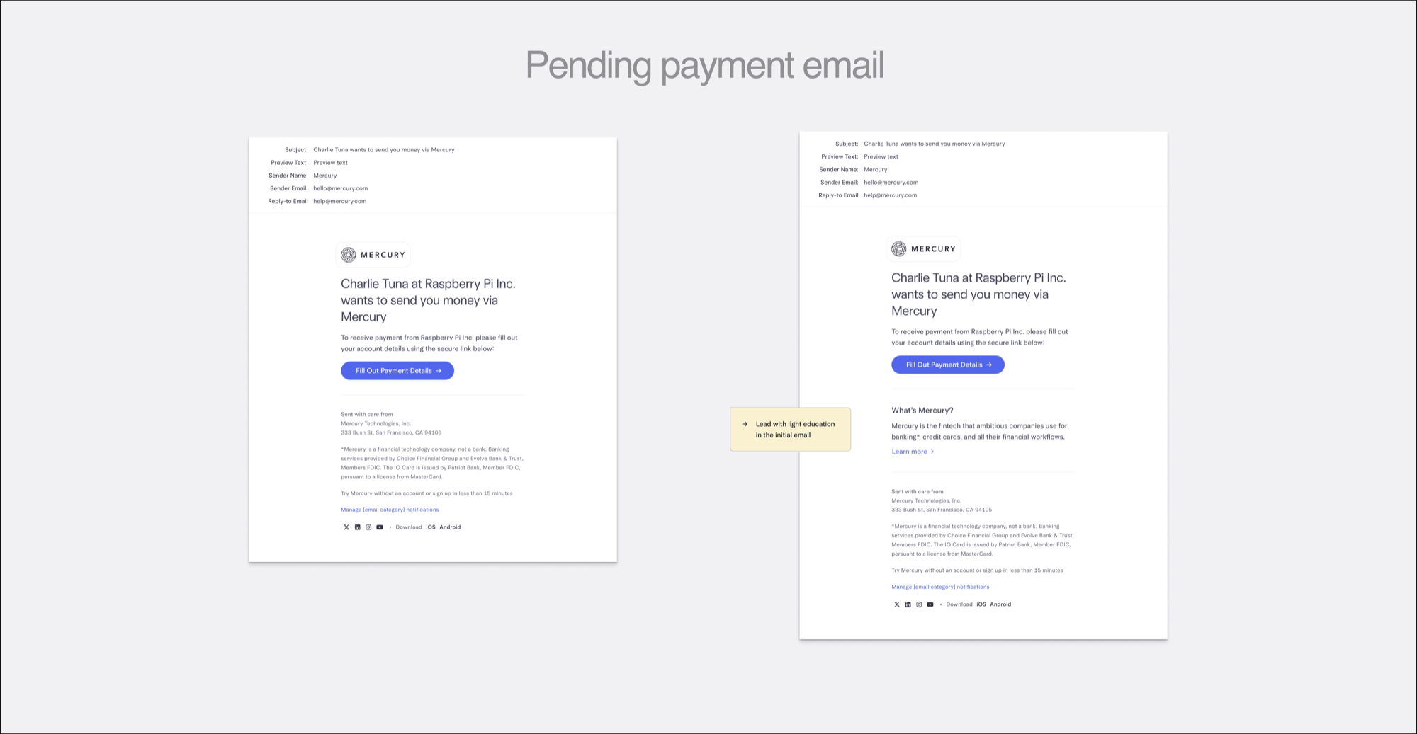
The initial notification email
Original copy was boilerplate. I added a one-line value-prop intro: "Mercury is a fintech that ambitious companies use for banking, credit cards, and financial workflows." Small change, but it sets the floor. By the time someone clicks, they know what they're walking into.
The landing page
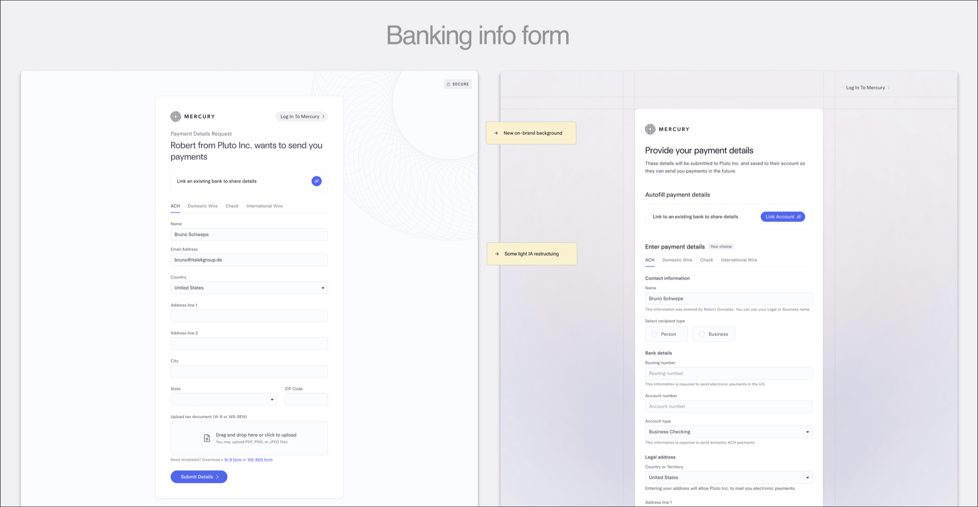
The form was unbranded, not mobile-responsive, and dense. The bigger redesign I wanted, breaking the single form into multiple lightweight steps and rethinking the information architecture, was out of scope for this round. So I made the pragmatic call: ship the rebrand, refresh the content container, and make it mobile-responsive. That last one was a real win because mobile traffic on these viral surfaces is significant and the legacy was desktop-first.
The success screen
Original was a thin confirmation. I redesigned it with clear hierarchy, restated the brand, and surfaced a few Mercury value props. Finally giving the user a reason to come back as a real Mercury customer instead of treating the interaction as a one-off bank-info dropoff.
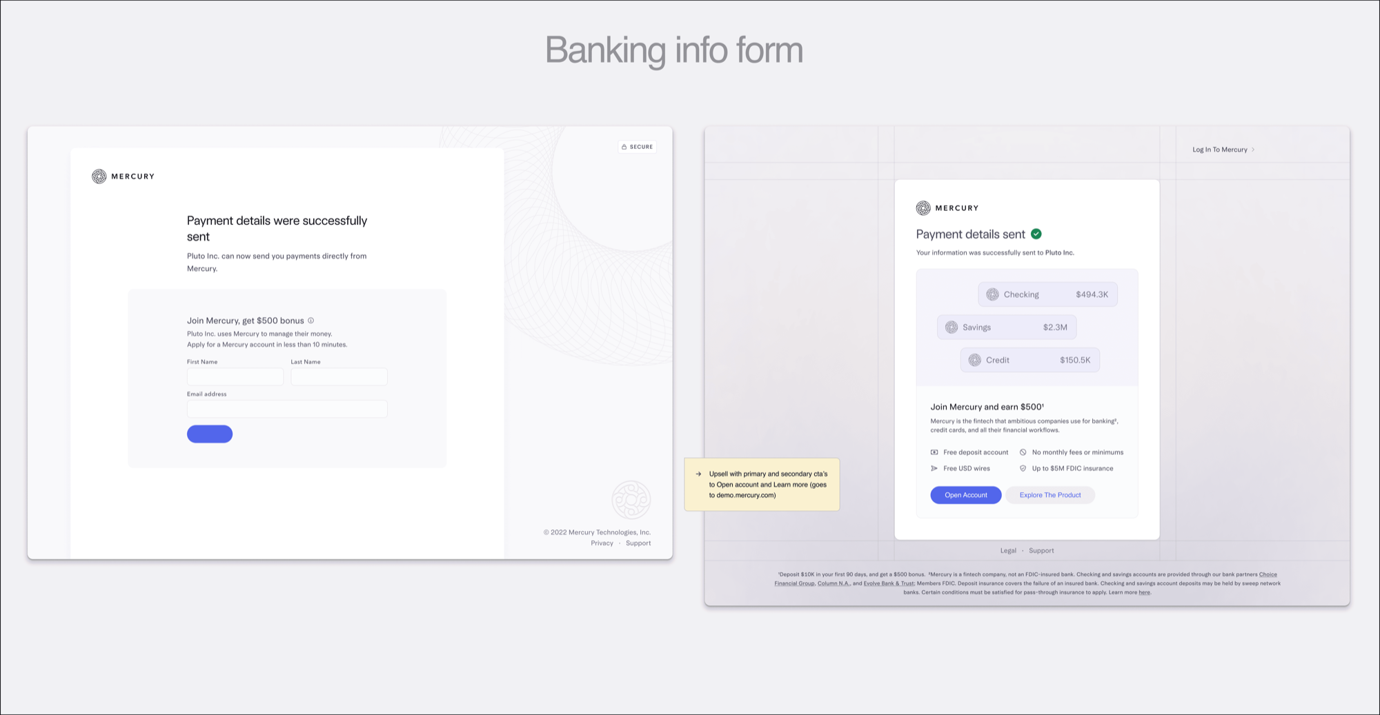
I explored a handful of layout and emphasis alternatives through internal feedback and lightweight customer testing before landing on the current implementation.
The success transactional email
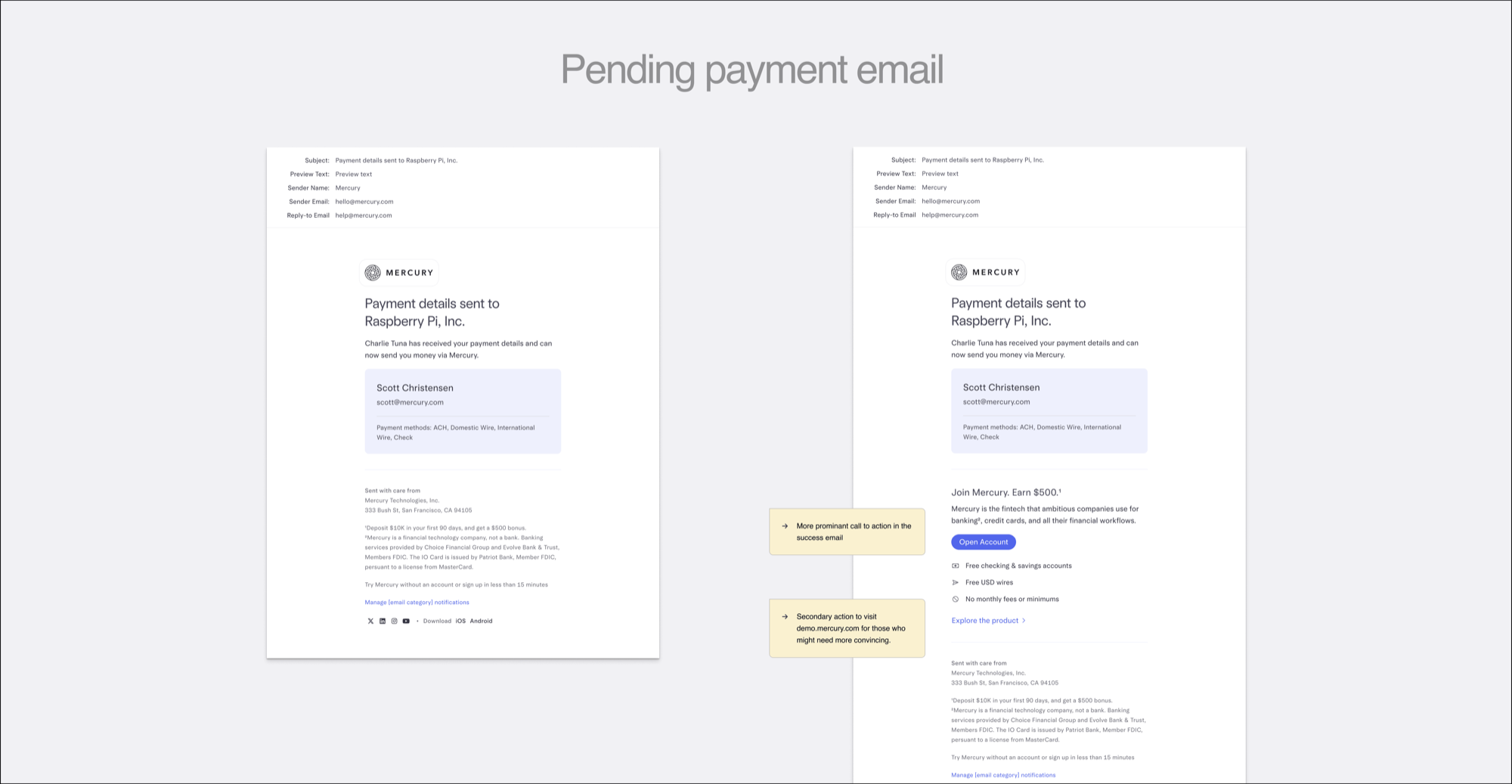
Once the user submits their bank info, they get a confirmation email. The legacy version was utilitarian, a "you're set" receipt with no follow-through. I rebuilt it with a prominent primary CTA back into the Mercury value prop, plus a secondary action inviting them to explore the product at demo.mercury.com. The email becomes the fourth nudge in the drip, not a dead end.
Killed ideas
The archive had a lot of explorations:
- Right-rail value props on the landing page. Killed for v1: too much visual weight before users had basic brand context.
- Customer logos / ratings / social proof. Killed for now. Social proof matters once users have a basic mental model of your product; here, users still need education first. We tested this hunch and confirmed it.
Hard call: ship within scope
I wanted to rethink the IA on the banking info form page: break the dense form into a multi-step conversational flow, like the Focused Funding work. Couldn't get there in one month with three engineers and no PM. The pragmatic call was to nail the rebrand, mobile responsiveness, and education layering for v1, and queue the IA work for a later round.
My Learnings
Drip education beats single-shot upsell
The old flow had one upsell at the end. The new flow has small, layered context at every step. The +6% lift came from the cumulative effect, not any one screen. Users coming in cold need a path, not a pitch.
Right level of polish for the cold-start moment
Social proof, logos, and ratings are powerful when users know what your product is. When they're seeing your brand for the first time, they need clarity, not credentialing. Get the basics in before stacking persuasion patterns.
Mobile-responsive is table stakes for viral surfaces
If the user is opening the email on their phone (most of them are), every step that follows needs to work on their phone. A desktop-first form is a leak.
Growth lives in lifecycle, not just product
The lifecycle touchpoints (emails, system notifications, transactional confirmations) are growth surfaces too, not just operational ones. The click-throughs on the email refresh tell me they pulled their weight in the overall lift. Education is hard to attribute cleanly, but the more you prime a user across the journey, the more each touchpoint feels like another beat in the same conversation instead of a one-off transactional moment.